Project
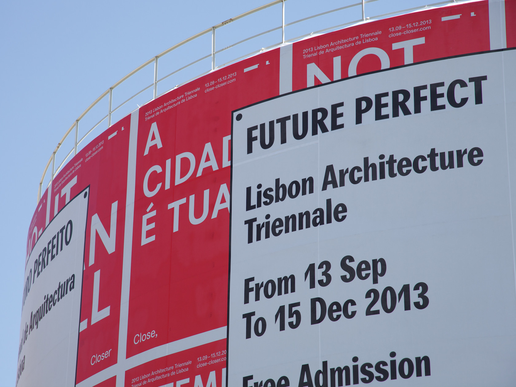
2013 Lisbon Architecture Triennale Identity
Year
2013
Location
Team
Typeface by Radim Peško
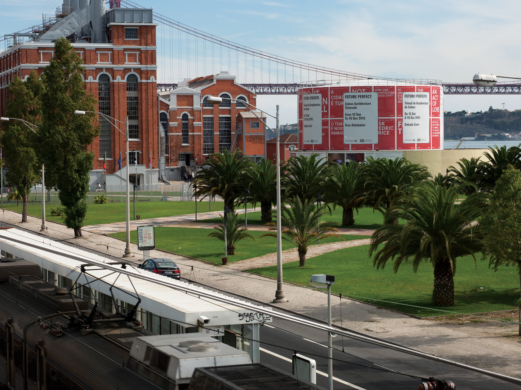
The third edition of the Lisbon Architecture Triennale—titled Close, Closer—considered the condition in which architecture is practiced and the way it is framed, expressed and understood today. We were invited by the chief curator Beatrice Galilee to contribute a visual identity and took an investigative approach by seeking ways for the public to be the generative force in the visual identity of the Triennale. Despite the lack of a singular logo, Close, Closer was given a strong and coherent form through the embrace of striking typography and bold colour that presented the responses in print material and public spaces throughout the city of Lisbon, sourced from the website we designed for the Triennale.
